For some time now, I have been wanting to create new work that is more aligned to what I’m currently drawn to. This summer I was given a chance to be a part of Illustrators’ Fair in London - one of my favourite fairs to visit. In the weeks leading up to the fair I had intense art block and felt indecisive about my ideas. I wanted to make something I could hand-finish and incorporate aspects of ephemera into such as faded ink stamps and yellowed paper.
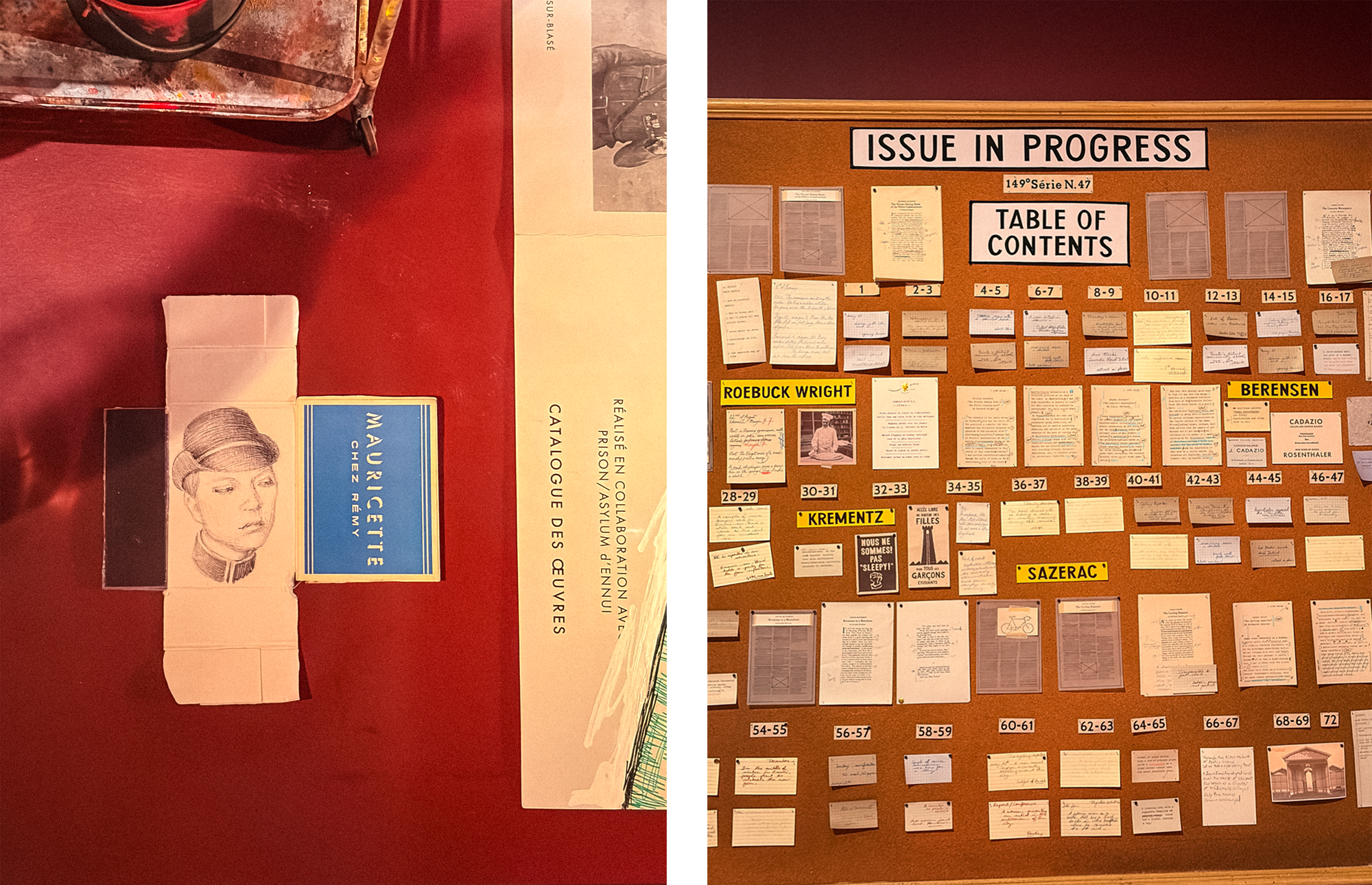
A recent visit to the Wes Anderson exhibition at the Design Museum pushed me further in this direction. The attention to detail in the prop design for these films is so instrumental towards the immersive worlds that they create. Seeing the imaginary covers, old passports, letters, packaging that were created to bring characters to life was so inspiring. I love Wes Anderson’s stop motion films and seeing the puppets from Fantastic Mr Fox and Isle of Dogs was fascinating.
This made me think about how I could lean into my own interests and create a narrative by incorporating similar objects. My aim in illustration is to capture small moments in time, where meaning can be implied rather than told.
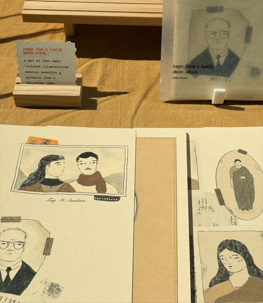
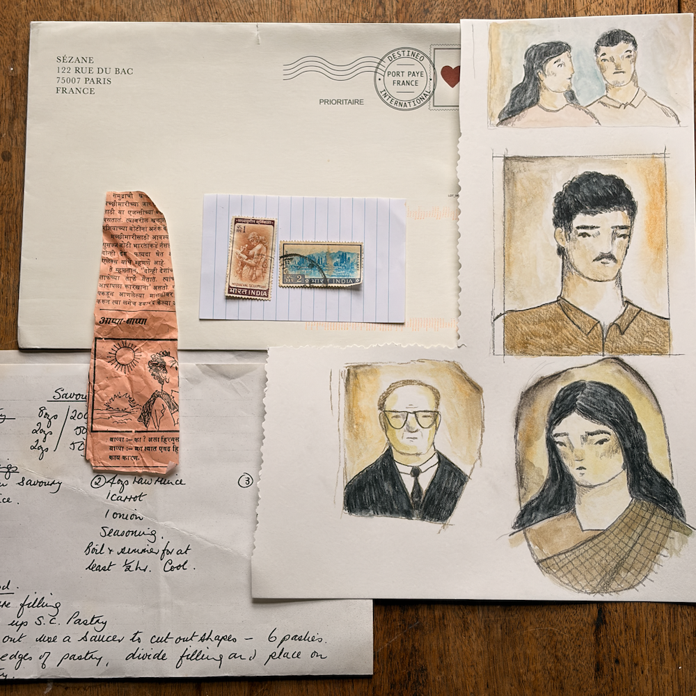
It was the week of the fair and I was feeling pretty defeated. I started sketching from imagination, drawing from the portraits I made for my zine, The Family Run Cafe. My aim was to keep them loose and retain a faded look by using Japanese Gansai paint, as well as pastel, watercolour and coloured pencils. In Procreate I collaged scans from my collection of paper - a photocopied recipe, an envelope from Sézane and vintage Indian stamps from a stationery shop in Khan Market, Delhi. Books that I kept going back to were Designing Props for Filmmaking by Annie Atkins and Sadak by Aradhana Seth.
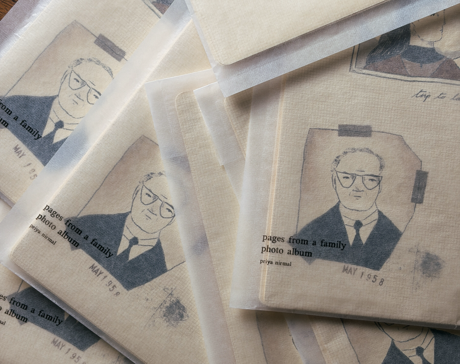
Amidst this, our trusty secondhand Canon printer gave up, and my partner quickly researched and found us a replacement. Many misprints later, I had a collection of five prints representing pages from an old family photo album.
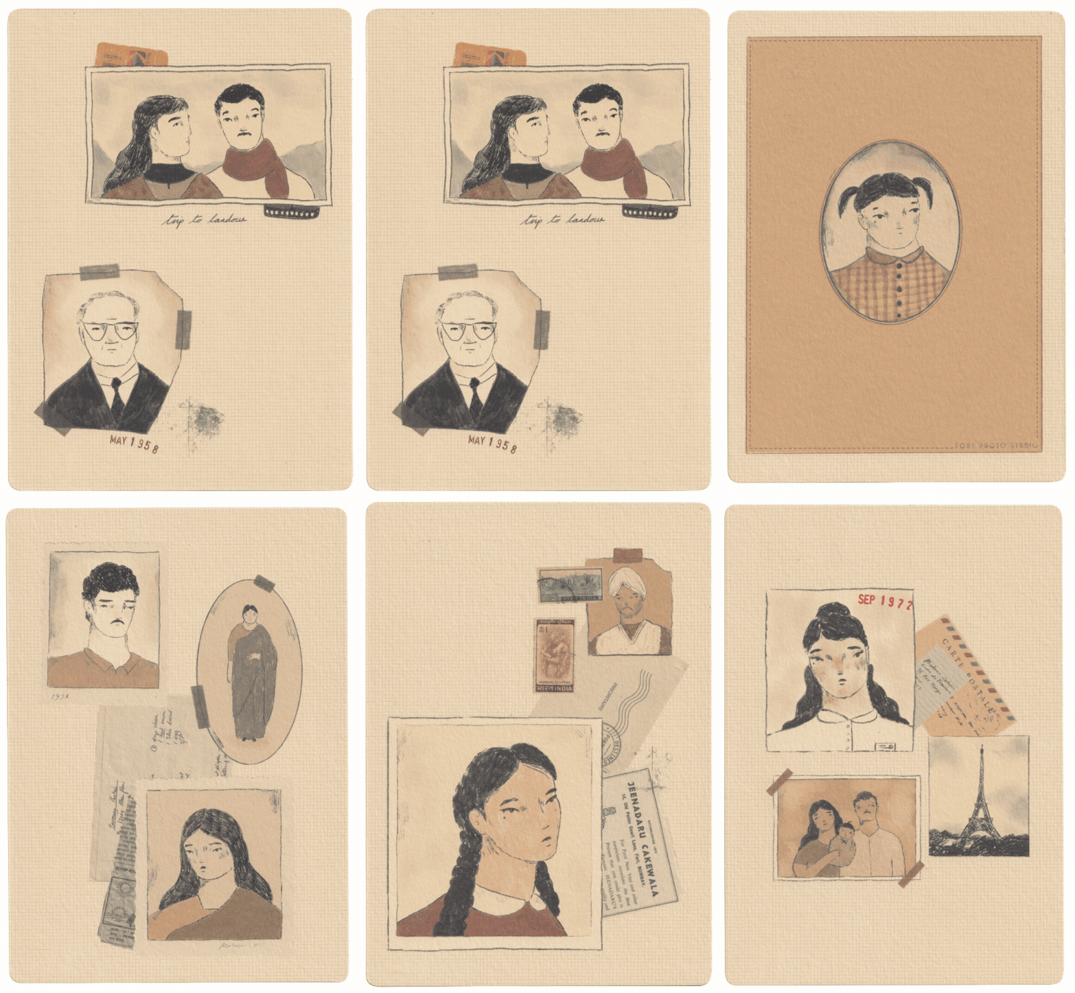
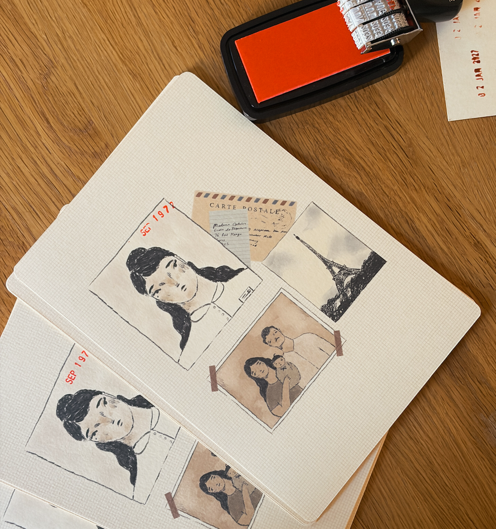
Printed on Daler Rowney Canford Paper, the yellow tone of the paper naturally muted the illustrations, adding to the aged look. We rounded the corners of each print and hand stamped the dates to achieve an imperfect individuality. Initially my plan was to create a series of portraits collaged with collected paper, however as I progressed I found my way towards a loose narrative. I wanted to keep it open for interpretation, avoiding being too on the nose. I fall into the habit of trying to preplan and think too much. The answer in every case is to just begin and let it fall into place. The more I create, the more inspiration starts pouring in.
“You can’t use up creativity. The more you use, the more you have.”
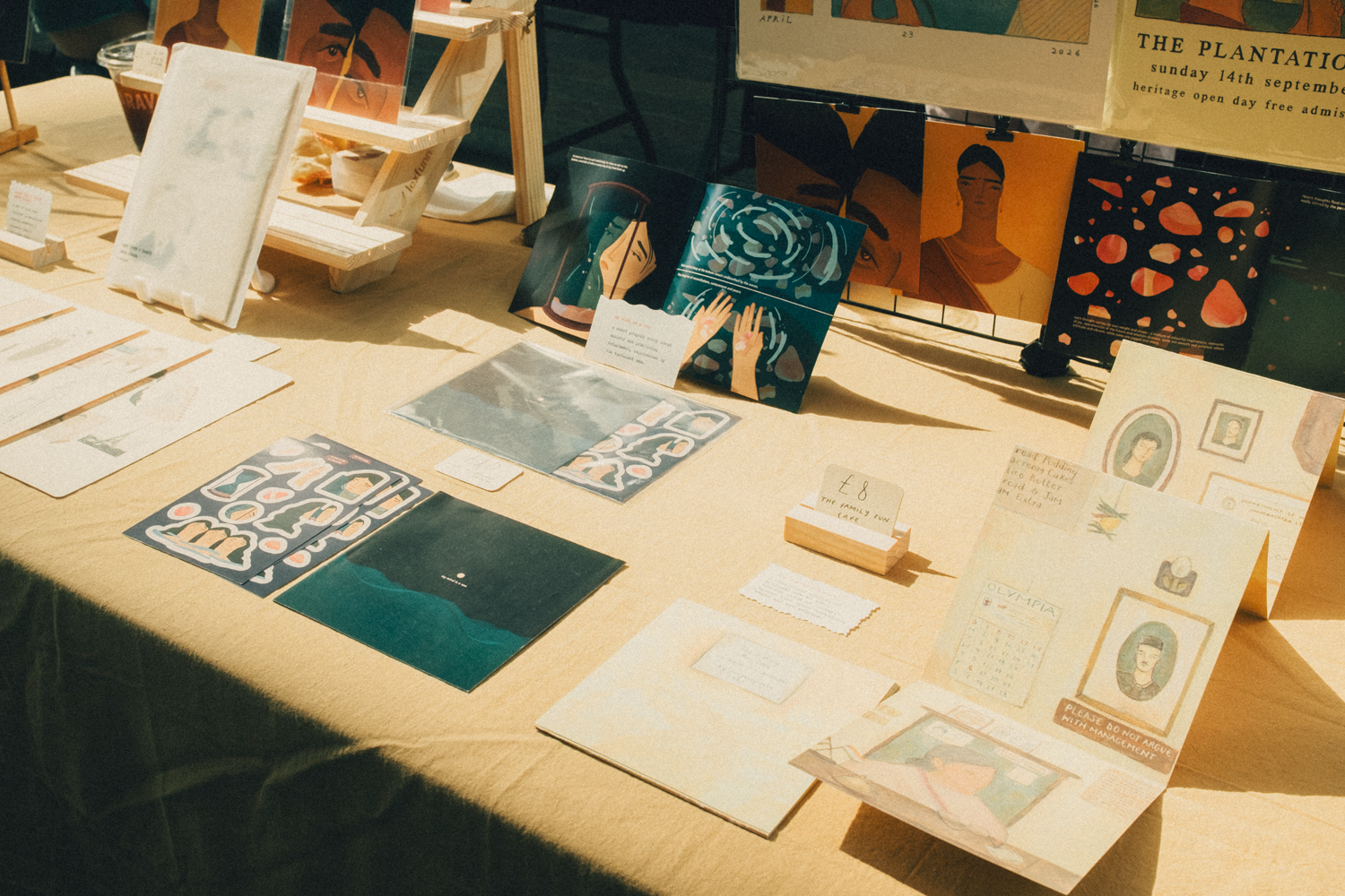
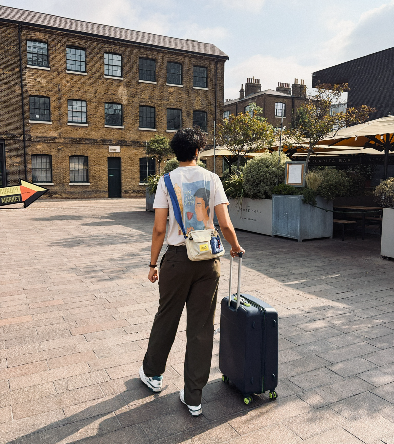
We wrote some of the labels for the table on a typewriter. Paired with off-white textured paper, this gave a delicate result. Finally the day arrived and it passed us by in the blink of an eye. We met the friendliest people, saw beautiful art and were thrilled by the response of our first London fair. The art world can be intimidating, but illustration is such a welcoming exception. The city has always had a huge place in my heart, I used to live very close to the area of King’s Cross that the fair was in. It brought back memories of this time nearly a decade ago. Past me could never have anticipated that I’d be part of this in the future. I don’t think I would even be drawing, let alone participating in something like this without the constant encouragement and kindness I get from my partner. I left feeling grateful and excited to draw more.